BenQ SW271 Photography Monitor Review
- Albert Dros
- Sep 25, 2018
- 8 min read
Updated: Mar 31, 2020
I am currently using the BenQ SW271 monitor for my image processing. I have been using this monitor for a couple of months. It’s now a crucial display in my work environment at home when I am working on images in between my travels. Full disclosure for this review: BenQ sent this monitor to me to test out. I have been using it for a few months and so far I am very satisfied with the display. In this review I’ll talk about the display itself and why exactly it is important if you’re serious about photography, especially printing your work.

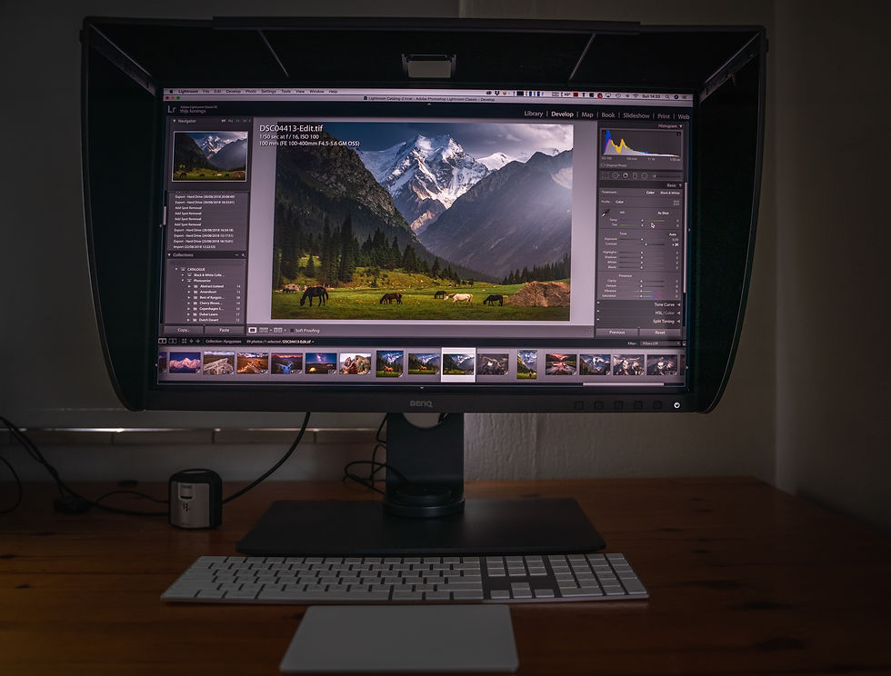
BenQ SW 271 monitor on my desk
Introduction
First, I would like to point out that I find displays and colour management an incredibly interesting topic. Mainly because we currently live in the age of social media. Most people see my images on a very small file size on their smartphone on Instagram. Others will see it on their computer at home on Facebook. Everyone uses a different smartphone and a different pc at home, so everyone is viewing my images in a different environment. When I upload my image on Instagram I work differently than why I actually print my images. It’s very difficult to make your image look ‘good’ on everyone’s device. For example, if I check my Instagram feed on my girlfriend’s iPhone 8 it looks very different than when I check it on my Sony Xperia XZ2 compact. My instagram feed looks a bit more ‘flat’And even my XZ2 compact and XZ2 Premium look different. And the Galaxy S9 looks crazy vibrant. Each phone has their own color scheme and display. You can often ‘calibrate’ it a bit in the settings, but you can never completely match them (trust me, I’ve tried to match even the displays of both of my Sony phones, I couldn’t do it). The differences between all the devices make it hard to decide on how exactly you would process images as a photographer.
Now, my main workhorse at home is an iMac 5k 2017. It has a beautiful 5k display but again, it looks different than my 2017 Macbook Pro. However, Apple devices tend to look decently similar across their devices, if we talk about the iMac, Macbook Pro and iPhones and iPads. But this is Apple. Considering half of the world is using Apple, processing an image on an iMac would mean that it would look decent for at least half of the world that is checking it on their iPhone on Instagram. This is a decent method and thought, but if you dive further into the world of colour it is still not satisfying, especially when we start to print our images.

Instagram feed on my Sony XZ2 Premium Smartphone
Colour Calibration
To keep devices and displays look similar you can calibrate your screen. Lots of people don’t know this or have never even done this. Some displays are more ‘accurate’ than others. By accurate I mean they have better specifications which makes it possible to display a broader range of colours and colour profiles. More on that later. To calibrate your screen you need a hardware tool. There are multiple tools available on the market. I am using the X-Rite i1 Display Pro which is considered one of the best calibration devices on the current market. Other good ones are X-rite Colormunki and the Datacolor Spyder. These devices include software that you run on your monitor. You then put the device on the screen. The devices will measure your different colours and brightness of your screen and will then try to make your screen ‘neutral’ according to industry standards. This is important to get an even result over all your displays, but more importantly to get a correct display of your images.
For example: If your monitor has a very magenta colour cast and you’re always processing images with this monitor without knowing the colours are very off, your images will look very green in a neutral colour space (green is the opposite of magenta). Lots of people will see your images with a green colour cast and when you’re printing them, they will come out green. You’ll wonder why your images look so weird when printed. This happens when you’re not familiar with different displays and colour calibration.

The X-Rite i1 Display Pro on the BenQ SW271 Screen
Going back to the quality of different displays, there are very high end displays that can, simply said, display a lot of colours. If you look at the Macbook Pro and iMac displays you would think they are the ‘high end’ displays. After all, everyone always says ‘If you’re in graphic design you need a Mac’ . However, this is not the case. Even the most high end Apple devices do not have displays that can display optimal colours. But they’re definitely not bad.
So how does this work? In the digital photography world we mostly use 2 different color spaces, sRGB and AdobeRGB. F-stoppers has a nice article about how example color space works. AdobeRGB has a wider color gamut which basically means it has the possibility to show a wider amount of colours. sRGB is widely used on the web, so be very careful if you output photos on AdobeRGB as they might show very flat when you post them on social media channels. When working with print, we mostly use AdobeRGB but you have to careful with ‘cheap’ labs and really let them know you’re using AdobeRGB or they might print your work the wrong way.

Blue triangle shows the Adobe RGB color range and the red shows the sRGB color range.
When we look at monitors, it is important that when we work in a certain color space, the monitor is able to display all of these colours with great accuracy. And that’s where ‘professional’ photography monitors come in. This is most important when printing your images. When we work in a perfectly calibrated colour environment where our screens can display the colours with perfect accuracy, if we print our images we will get a print that looks exactly like how it looks on our display. Ultimately, this is what we want.
With that, the most important aspects for me in a screen are:
Full or almost full reproduction of the needed colour space, in photography that’s AdobeRGB and sRGB.
Good color reproduction and brightness.
Uniformity: the screen has to be similar in color and brightness across the whole surface.
Size: has to be not too small but also not too big. I prefer 27 inch.
With that short introduction about colour and calibration and why exactly it is important to get a professional screen, let’s look at the BenQ SW271.
BenQ SW271 Photography Monitor
Important BenQ SW271 specs:
27 inch IPS panel
4k display
1000:1 contrast ratio
60hz 5ms
10-bit color
99% AdobeRGB, 100% sRGB (this is why a photography monitor is important)
HDR functionality
USB-c, HDMI and normal USB inputs
Shading hood
Hotkey Puck for quick selection of colour profiles
For the full specifications, head on to BenQ’s website:
https://www.benq.com/en-us/monitor/photographer/sw271/specifications.html
When I received the box the first thing I noticed was the Calibration report. Lots of technical stuff on this one, but the fact that this display comes with a individual calibration report already proves we are dealing with a professional product here. BenQ tests each individual unit (not just a batch) and gives you a calibration report with it. This does NOT mean you don’t have to calibrate it. You still have to do a hardware calibration for the best results.

Calibration report of the BenQ SW271 monitor
The monitor comes with lots of different cables to connect it to your preference. And setting it up is super easy. Also included is a Hotkey Puck that you can use for some quick functions like switching colour profiles. You can customise the functions of this Puck and configure it up to your preference.


Hotpuck with buttons you can configure. The Puck fits into the design of the food of the panel. You can also remove from this position and put it anywhere you like.
Talking about customisation, this monitor has a nice amount of buttons that you can almost all configure to specific functions. The monitor has a decent bezel with the buttons located at the bottom.


Next to the on/off button the BenQ SW271 has 5 other buttons to control the menus. 3 of those keys are customisable
The stance of the monitor is big and firm, but the monitor has that modern look with it. It looks beautiful in the office. The shading hood that’s included is a great addition. Some other expensive monitors let you buy a (costly) shading hood separately but BenQ includes their own. And it’s not some cheap hood. The opposite is the case with a big curvy design that really pulls you into your images when you attach it. It blocks incoming light from the top and both sides which works as it should. There’s an opening on top (that you can open or close) that is designed for a hardware calibrator.

Real world use
The last few years I have always worked on higher resolution displays with maximum of a 5k resolution on the iMac 5k. Therefore it didn’t take me any time to get used to the beautiful BenQ 4k display. I love editing on higher resolution displays especially regarding lay out of software and text I am able to squeeze lots of stuff on my screen while still having more than enough space for the image itself. When I compare the use of my 5k iMac to the BenQ monitor the interesting thing is that the BenQ monitor seems way more ‘relaxing’ to look at. I think this is a combination of the shading hood and the fact that it is a matte screen. It just really relaxes the eyes when editing.
My editing takes place in Lightroom and Photoshop. With 4K resolution I have lots of space for everything I need.
The picture quality and colour rendition is great. It’s also very uniform. A cool thing is that it’s 10-bit so gradients look very smooth without banding. Over a couple of months I have processed many images with this monitor and also printed a bunch. Special shout out to the L-Type guys here. They’re doing some amazing 400DPI prints that are very detailed. The prints came out exactly how I had envisioned them on the AdobeRGB profile with the BenQ monitor. Overall I am very satisfied.

Color accuracy is very important when printing my photos.
I found the hotkey puck very useful for quickly switching between AdobeRGB and sRGB. I also set up Advanced Black & White to a button. to quickly check images in black & white.
The SW271 has lots of functions, great customisation, an included shading hood and very accurate colour rendition AND 4k resolution with a price tag of ‘just 1200 euro’. This would be a lot for a monitor for a lot of people, but lots of professional photography monitor are way above this price level. The BenQ SW271 is great bang for buck and is really one of the best to get at it’s price.
In short:
Great rendition of color
Uniform
‘Relaxing’ to look at
Nice shading hood included
Button customisation and Hot Puck for quick switching between color profiles
Nice design
Amazing bang for buck
Some images processed with the BenQ SW271:


My last few image series have all been processed on the BenQ SW271 monitor. Check them out here:
To close this review I would like to point out that working with a professional photography monitor takes some time to get used to if you're used to working on Apple screens (like the iMac). I have this with new screens in general. You really have to 'learn' your screen. After having worked on the BenQ SW271 I can't go back to editing on the Apple 5K screen. Not only because it displays 'less' colour, but also because of the glossiness and it's much more intense to look and work at. In my opinion, a professional photography monitor can really bring your images to the next level, and the BenQ SW271 does just that.
Buy this monitor:
Thanks for reading.
Albert

